The line graph is the most popular graph and has many purposes.
The commonly used line graph consists of a x-axis and and y-axis. The x-axis (which is the horizontal line) usually measures a unit of time, while the y-axis (which is the verticle line) usually measures a unit of quantity. You should however note, the x-axis and y-axis can be applied to measure various units.
See below for the x-axis (left to right) and y-axis (top to bottom):
Also note that the y-axis can be on either side, as well as, the x-axis be on top or bottom.
Here is an example of a line graph with a single item:
This line graph shows the increase in sales due to the 2009 marketing campaign. In the graph, the blue line represents the change in sales from quarter to quarter. The x-axis represents each quarter, while the y-axis represents percentage from 0 to 100.
Here is an example of a line graph with multiple lines:
This line graph shows the products sales for three different products in the first quarter of 2012. The x-axis represents the first quarter (by month), while the y-axis represents the number sold, in millions (as an example 2 = 2,000,000).
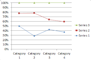
Here is an example of a line graph with markers:
In this graph you can see "markers" in the shapes of squares, diamonds and triangles. These markers are used to show your audience distinct points in your graph. In this graph the markers are used to show the mid-point of each category. Corresponding on the right of the graph, the markers are explained so the audience understands which marker represents which item.


No comments:
Post a Comment